Hands-on Machine Learning with Campus Wi-Fi data
Introduction
At the TU Delft ICT Innovation department, we are looking into ways to support researchers using Artificial Intelligence (AI). After talks with our first 16 AI labs, I realised I need to know a lot more about AI.
Machine Learning is one of the most popular forms of AI, so I decided to start there. For Machine Learning to work well, you need lots of data.
In June 2021, my colleague Lolke Boonstra and David Šálek from SURF, launched the TU Delft ICT data platform. This is a streaming data platform that streams anonymised campus Wi-Fi connection data. As a contributor to this project, I have access.
This blog documents my first steps in Machine Learning. I follow Chapter 2 of ‘Hands-On Machine Learning with Scikit-Learn, Keras & TensorFlow’ by Aurélien Géron (accessible here for TU Delft staff). I use campus Wi-Fi connection data from the ICT data platform. My goal is to predict how busy a building on campus will be, at a given date and time.
Discover the Data
The first step is to discover the data. Each building on campus has several Wi-Fi access points. The IT department monitors these access points every 5 minutes to make sure everything is working properly. The ICT data platform collects this data and live-streams it.
 First steps aren’t always easy
To make my life easier, I first captured a week of data in a text file. I then cleaned it up so I was left with rows containing:
- a time-stamp
- the building where the access point is located
- the number of connections
Not every access point is monitored at the exact same millisecond, so I added up the total number of connections per building, in each five minute interval. I now had a clean dataset to work with.
Before going any further, I set aside 20% of the data, stratified (selected proportionately) over the different buildings and randomly selected in the time. This is the test set, which I’ll use at the end to test how well my models are working. The remaining 80% is my training set. This is what some of it looks like:
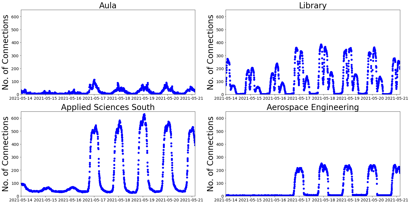
The data starts on a Friday afternoon and runs for a week. You can see that there is a daily rhythm with what looks like a lunchtime dip.
The top row has data for the Aula and the Library. These two buildings are next to each other in the centre of the campus. At the Library, it looks like people come back to study after their evening meal, whereas the Aula is looking a little neglected.
On the bottom row, there is data from Applied Sciences (AS) South and Aerospace Engineering (AE). Again, two buildings close to each other, this time at the south of the campus. It looks like AE takes weekends very seriously, whilst at AS South they seem to be more afternoon people. Their highest peak is after the lunch dip.
I was wondering why there were so few connections on the Friday afternoon at the start of this one week period, compared to the Friday afternoon at the end of the period. The first Friday was the day after Ascension and was a collective free day. That could explain it.
I’m lead to believe that a person on campus has, on average, more than 2 Wi-Fi connections at a given moment. It’s also important to note that some connections are from devices, not associated with an individual. The number of connections doesn’t tell us how many people are in a building, but it does give an indication of how busy the building is.
Preparing the Data
Géron warns that preparing data takes a lot of human effort, compared to applying a Machine Learning model. He was not joking.
 Preparation is the key to success
The timestamps in this data are measured in milliseconds, starting from midnight UTC, 1st January 1970. I decided to introduce a personal bias by adding some extra attributes (also called features). The idea is to help the Machine Learning model discover useful patterns in the data. I added:
- day of the week
- time of day
- weekend or not
Inspired by the low numbers for the collective free day and the after dinner numbers at the library, I also added:
- University/National holiday
- academic year category
Following Chapter 2, I:
- checked there was no missing data
- used a ‘One Hot Encoder’, to convert the building and the academic year roster category into a convenient matrix form
- used a ‘standard scaler’ for all other attributes. This helps the models when numerical attributes have different scales (e.g. day of week from 0 to 6, number of connections ~100s)
- wrote a transformation pipeline to add attributes and do transformations ‘automatically’
Writing a pipeline seems like a lot of extra work at the time. However, when I had to repeat these steps, in the right order, to test parts of the data, create graphs for you and move to a larger dataset, I saw the wisdom of Géron’s advice.

Automate your process with a pipeline. Wise words indeed
Train a Model and Validate
Now we finally get to train and evaluate Machine Learning models. Following Chapter 2 again, I chose two different models:
- Linear Regression - which models relationships by drawing the best straight line
- Tree Regression - which creates a kind of decision flowchart to predict a value
I used ‘cross-validation’ to get a feel for how well the 2 models work. You can skip the rest of this paragraph, if it’s too confusing. Cross-validation involves dividing up the training data into batches, setting one batch aside, training the model on the remaining batches and calculating the root mean square error for the set-aside batch, thus validating the model. Cross-validation then cycles onto the next batch, until each of the batches has been used for validation. Géron explains it better.
For Linear Regression, the average error was 99 connections. To be more precise the mean root mean square error was 99, with a standard deviation of 3.5.
For Decision Tree Regression, the average error was 5 connections. Again, to be more precise, the mean root mean square error was 5, with a standard deviation of 0.17.
Decision Tree Regression seems to do a lot better than Linear Regression, but what does it actually look like? Without my extra attributes:
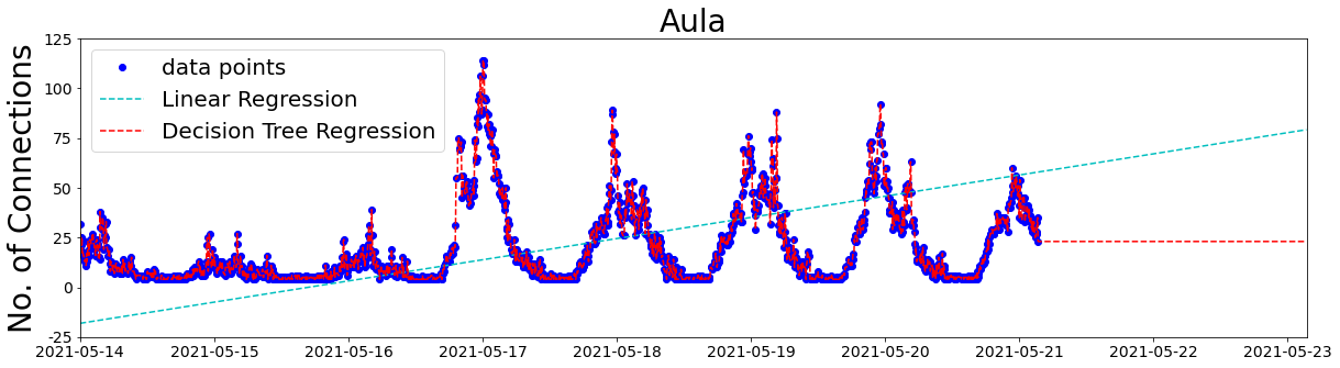
Linear Regression can’t do any better than a straight line. Decision Tree Regression is doing very well at fitting the data points, probably too well, or overfitting. That could explain why the Decision Tree Regression model is not so good at predicting the future.
Does adding my extra attributes help?
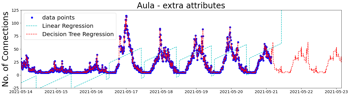
Well, Linear Regression is doing a bit better, except for the negative number of connections and the future predictions. On the other hand, Decision Tree Regression predictions are looking a lot better.
The best way to reduce overfitting is to add more data, so I collected 3 more weeks. Here are the data points and the predictions for the Aula, with my extra attributes:
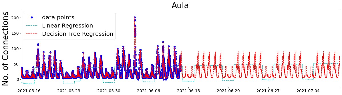
Okay, that’s not looking bad. The weekly and daily patterns, and peak number of connections are looking quite good for the Decision Tree Regression model. If you look carefully at the bottom of the Linear Regression plot, there is a slightly increasing trend. This could be real, as COVID restrictions are being eased. On the other hand, it could be a result of the collective free day and Whit-Monday leading to more holidays in the first half of the data collection period.
…and what happened in the Aula on the 3rd June?
…and which of my extra attributes is responsible for improving these models?
Following Chapter 2, I applied the Grid Search technique. This technique is usually used for hyperparameters, which I need to learn more about. I used this technique to turn my extra attributes off and on.
Grid Search calculated that adding the weekend status and the academic year roster doesn’t improve the model, but adding each of the other attributes does. As I only have 4 weeks of data, I’m guessing it’s difficult to find patterns associated with the academic year roster. Also, because the model already has the day of the week, adding the weekend status probably doesn’t add any extra useful information.
Using the best combination of extra attributes for the Decision Tree Regression model gives these results:
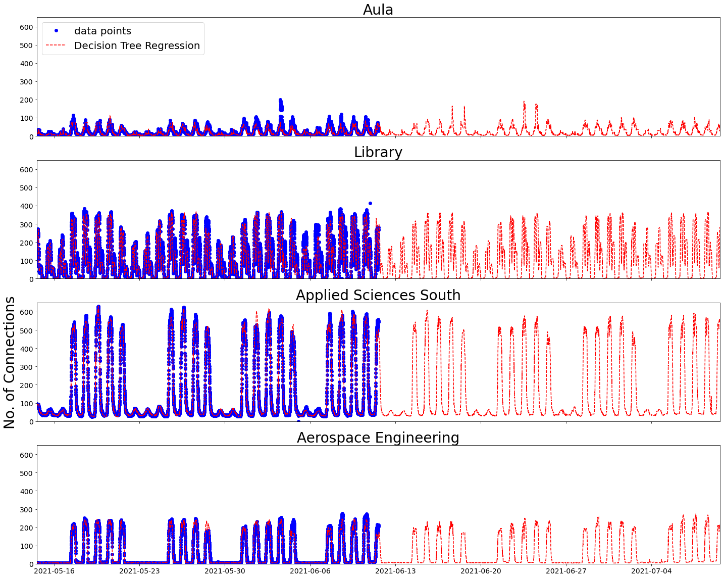
I can now return to the test set, the 20% I set aside at the beginning. Evaluating my best model on the data points in this test set, I get an average error of slightly more than 7 connections. Given that the number of connections varies between zero and a few hundred, I’m quite pleased with that.
I like the way the model sees a difference between weekdays and the weekend and didn’t get confused by Whit-Monday. I’m also pleased that the model predicts a lunch dip for all 4 buildings shown, but only the Library has an after dinner peak.
My biggest hope is that by September 2021, this model will be completely useless.
Lessons learned
- Géron’s book is a great way to get your hands dirty with Machine Learning
- I still have a lot to learn. It took me around 7 days over the past six weeks to get to this point. Running the models only takes a few minutes
- The ICT data platform is a really interesting, real-time, anonymised source of campus data. I did not do it justice in this blog
- This is not the way you should do machine learning on time-series data. There is a whole section on this in Chapter 15, but I haven’t got that far yet
- Even with limited knowledge, simplified data and basic Machine Learning models, you can make a feasible looking prediction of how busy a building is going to be
Wrap up
If you want to see exactly what I did, here is my repository.
If you would like to know more about the ICT data platform, or use the data for your research, please contact Lolke Boonstra.
If you would like me to put you in contact with someone who does know what they are doing with AI, or you want to help me improve my AI skills, or you want to join me on this journey of discovery, or you think I could help you with your research in any other way, I would be delighted to hear from you.
This blog expresses the views of the author, Susan Branchett.
This article is published under a CC-BY-4.0 international license.
Image credits
TU Delft IDE building courtesy of Gerd Kortuem.
First steps aren’t always easy.